It’s not a big deal to launch an online store nowadays and even to promote it on different resources. But what you show in your ads and on the store are completely different things. Constant optimization requires frequent analysis and improvements. If you are ready to be 100% attentive to this and if you are ready for tests and brave measures, this means you can’t escape the sales growth.
There are a lot of ways to boost your conversion. I will dwell on some of the most crucial – to be implemented in the shortest possible period. If you need more information and more complex solutions, you may always ask me directly.
Relevant call to action buttons to increase the conversion rate TODAY
The quality of a single button decides everything: its size, shape, color, the text on it…these elements if combined correctly work wonders. You just want to click it. And you know what? To achieve this effect, things should be tested. It’s rather a bad idea if you decide to place long square buttons of one color and leave such things forever (just because someone else has done it). E-commerce giants do not need to be too much obsessive about such details and you know why. They have long ago earned respect, trust and people no longer pay attention to small details. But before you become one of those giants, it’s worthwhile to make changes like this. We tend to underestimate small nuances very often, but they can really influence the decision: to make a purchase or to leave the store once and forever.
Test different shapes, colors and different kinds of content: you can try “Add to my cart” instead of simply “Buy”. Make the content more personalized and more appealing to your visitors. They should feel as if the item they are looking at already belongs to them.

Take an advantage of the abandoned carts to improve the conversion of your eCommerce store
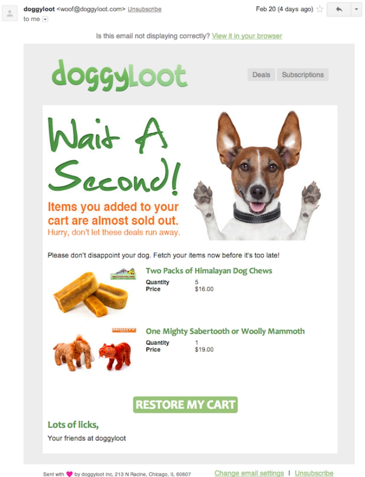
People forget to buy something or simply change their minds and abandon their carts. Let’s kindly remind them about the chosen items with the help of emails and remarketing. If you haven’t yet done this, I have great news for you: thousands of eCommerce store owners use these tactics and they don’t regret, because it really works.
As for emails: all you need to do is to write a convincing, unobtrusive letter and design it in a proper way. By the way, it’s not highly necessary to compose a complex html letter. An ordinary letter works well too. It should be decent in terms of grammar and politeness. As for remarketing: you are reminding about the abandoned goods with the help of ads when the visitor browses other websites. You shouldn’t reinvent the wheel here, seriously. Just show the item and add the time limitation.

Make the checkout process as simple as ABC
We all know that the shopping process should be simple and pleasant. That’s why we love shopping actually: we love it because it gives us positive emotions. Imagine that you are trying to purchase something and suddenly you are asked to fill in the huge form (as if you are going to become a member of a secret community). You don’t have time for all this. And even if you have, you really don’t want to do it. Give your visitor two options: to register as a new member and to get bonuses for this or to checkout as a guest.
Your support and presence are appreciated: implement a live chat
You can’t even imagine how many online stores have lost their clients simply because they didn’t provide the answers to the clients’ questions in time or failed to solve any of the client’s problems…in time! Live chat is created to strengthen the bond between your online store and its visitors. It’s not about simply implementing a live chat and allowing your staff to go and sip coffee all day. It’s all about your presence and your readiness to help whenever your clients need it. Such gestures are rewarded.
Now I see you: use tools to track every action of your customer
What do you usually do, when it comes to searching for weak places of the online store? There are tools which will help you to see the most problematic and most advantageous places of the online store. Personally, I can’t imagine an e-commerce store without Google Analytics. It shows:
- Who is visiting your online store
- How they are getting to your site
- What they are doing there
- Whether they did what you wanted them to
This tool is a must-have for your business to be 100% sure that you are not throwing your money away.
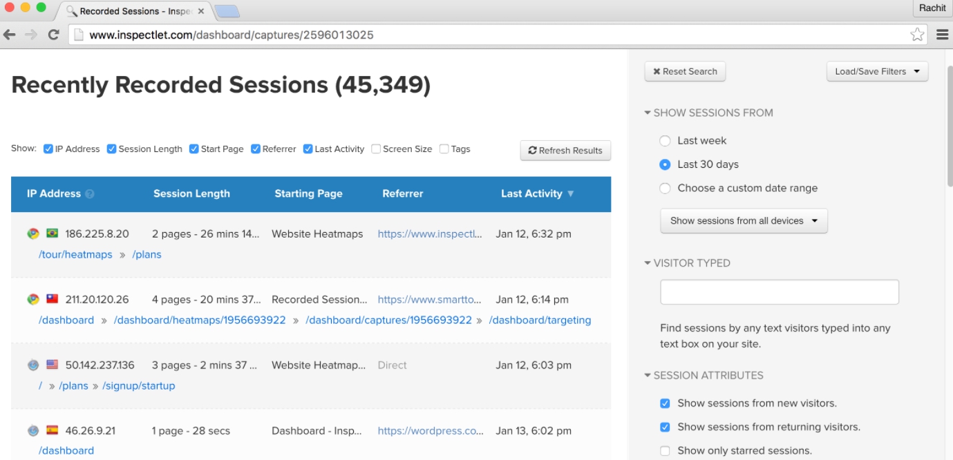
I suggest you trying Inspectlet. Having all the necessary numbers with Analytics is a good thing. But seeing everything your visitors do with your own eyes – is a different story. No more guessings, no regrets. It’s like you were browsing your store together with your visitor, sitting right beside him.

There is one important thing you should keep in mind: your traffic should be relevant. In such a way you will be able to analyze the conversion correctly and draw the right conclusions.
Good tips. Thanks for sharing.
You are welcome!